1.overview
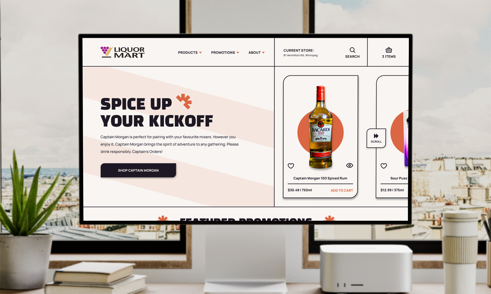
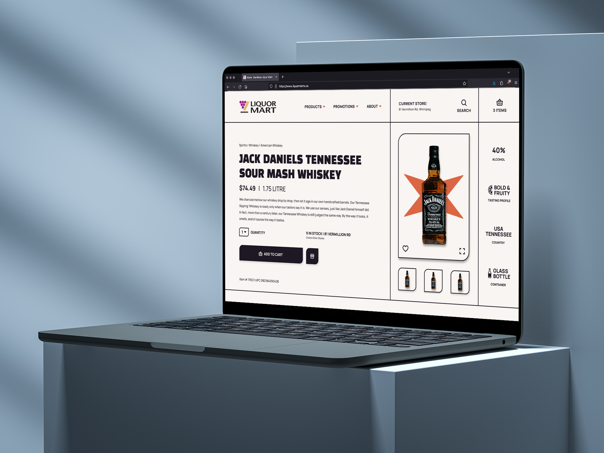
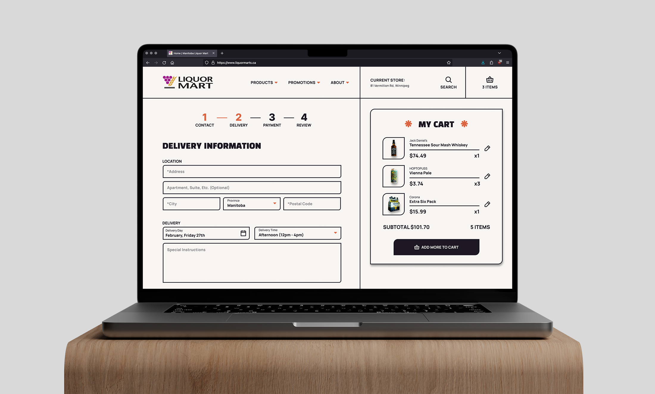
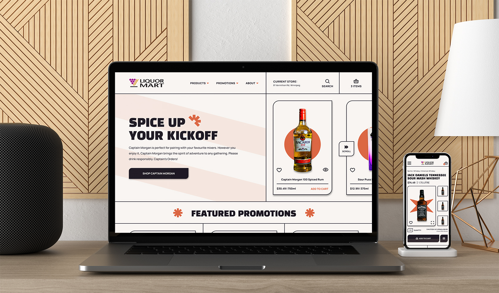
The Liquor Mart website needed a redesign as the original site appeared outdated and cluttered. My goal was to modernize the site by creating a more engaging and user-friendly experience, with a clean design that aligns with current trends and the brand's voice.
Process
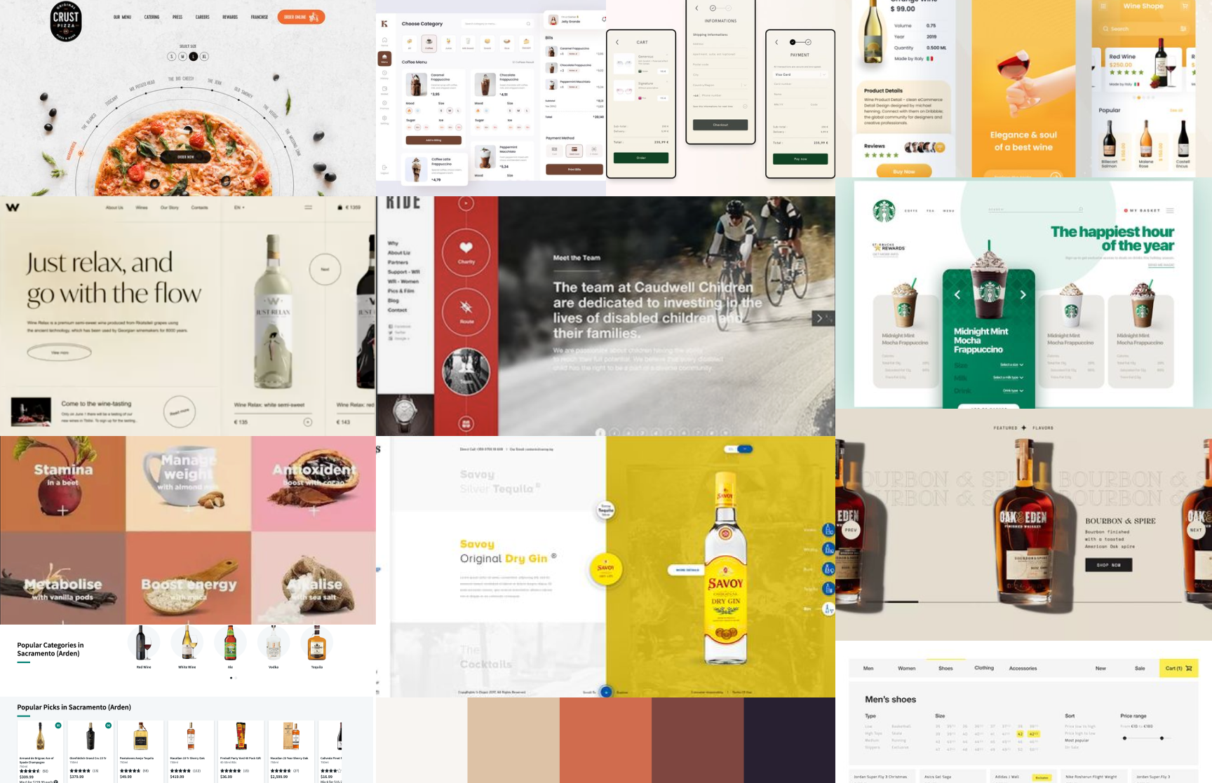
I began by researching current design trends and gathering inspiration to create a moodboard, which helped define the visual direction for the redesign. I then implemented a new style featuring visible grids and bold elements to create structure and enhance readability. Wireframes were developed and tested to ensure the layout was clear, intuitive, and visually appealing.
3.outcome
The redesign resulted in a modern, clean website with a fresh and engaging look. The use of grids and bold elements improved the overall structure, making key information more prominent and easier to navigate. The new design successfully updated the site’s visual identity, giving it a more contemporary and dynamic feel.
Try the prototype
Project Gallery
Liquor Mart
