1.overview
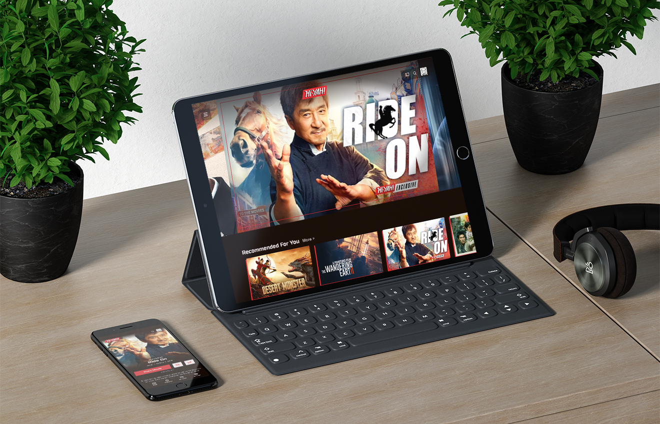
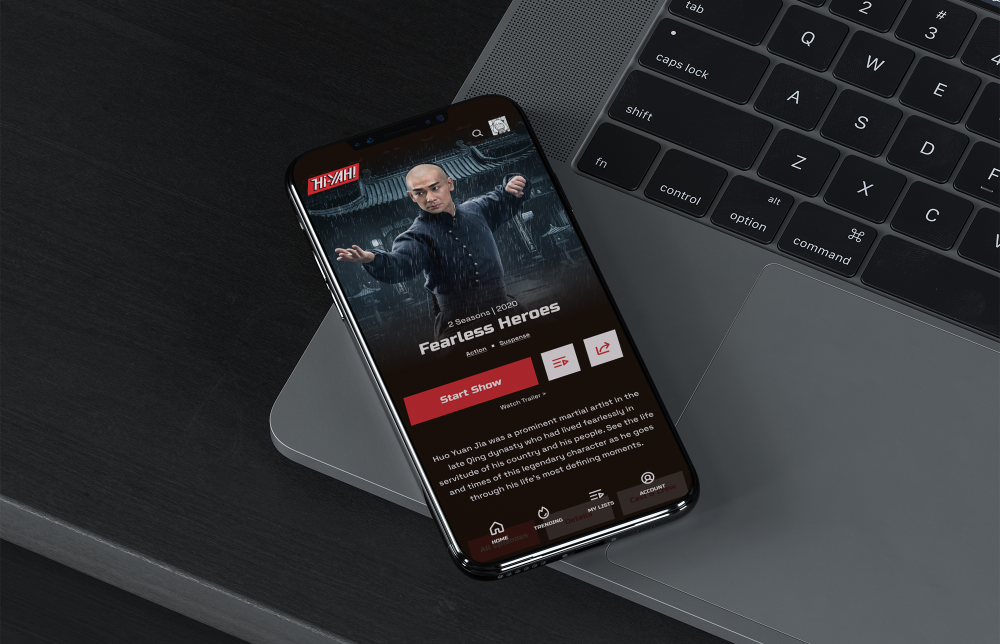
Hi-YAH! is a niche streaming service focused on martial arts and Asian action content. The platform, while functional, lacks the energy and personality that its logo conveys. My goal was to redesign the app to create a more engaging experience, aligning the overall layout and design with the excitement of the media it offers, and improving user engagement.
Process
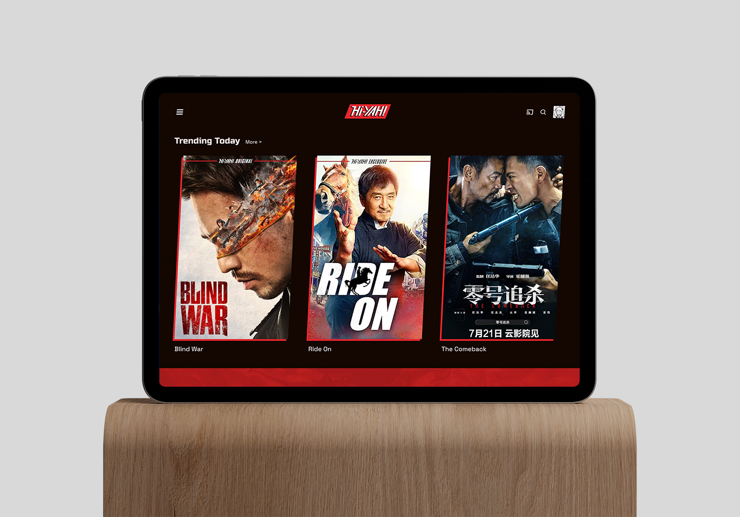
I began by analyzing the current site’s design and identifying areas where it felt static and lacked personality. I set out to make changes to the overall layout, such as enlarging media boxes for better visibility on tablet devices, and enhancing the user interface with custom design elements to better reflect the dynamic content. Wireframes and prototypes were created to test these updates and ensure they improved the user experience.
3.outcome
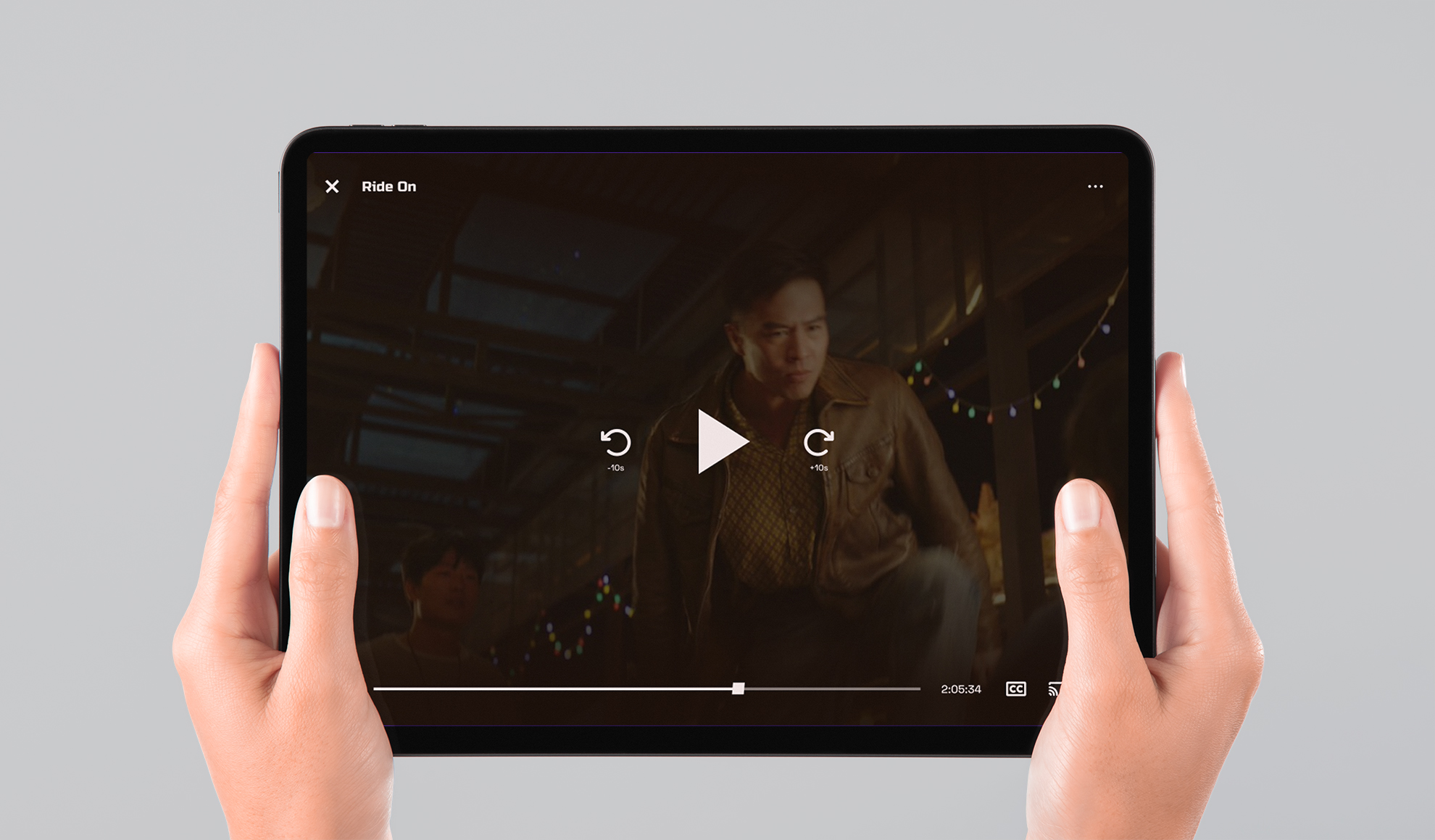
The redesign gave Hi-YAH! a refreshed look that better aligned with its action-packed content. The larger media boxes and personalized design elements made the app more visually appealing and easier to navigate, especially on larger screens. These updates helped the app feel more engaging and reflective of the thrilling media it offers.
Try the prototype
Project Gallery
Hi-YAH!


